If you are looking for tips to improve the appearance of your Twitch page or to make your Twitch channel look more professional, you have come to the right place.
In this article, I will assist you in improving the quality of your Twitch channel page.
Achieving success as a streamer on the Twitch.tv platform involves more than just the games you play. It is not solely dependent on your identity, either. A key factor in building a successful Twitch channel is representation.
Take Care Of Visuals
Create a brand that will differentiate you from other streamers. If you are unsure how to do that, you can use templates and customize them to your ideas. Try to make your brand design personal and unique to your Twitch channel.
Also, carefully choose your channel picture and Twitch banner, as those are the first things people see when they visit your Twitch channel.
Make Use Of Twitch Functionalities
To have a great-looking Twitch page try implementing these into it:
- Widgets for interaction and visualization
- Overlays (what your viewers see on their screens while watching your stream)
- Twitch alerts (you can customize their sounds
- Create a catchy panel
Table of Contents
Twitch Profile Design
In my experience as a member of the Twitch streaming community, I have noticed that most individuals prioritize visual design above everything else.
This is because discovering and developing your visual brand can be quite enjoyable.
This allows you to explore and create digital content that clearly communicates who you are and what viewers can expect.
But don’t misunderstand me; although it can be enjoyable, it remains a journey.
There really isn’t a wrong answer when it comes to enhancing the appearance of your Twitch channel.
However, there are several dos and don’ts that you may want to keep in mind.
The first thing I want to discuss about enhancing your Twitch profile is the process I use to find a design I like.
I constantly change my designs, adapt them, and refine my work.
When I start working on a project, I toss ideas onto my screen.
Ideally, I am looking for things that resonate with me and work best for my needs.
I am exploring various shapes.
I am exploring different color palettes and new techniques.
Additionally, I am exploring other streamers, brands, and companies that excel in design to draw inspiration.
I then analyze all these different influences and determine what I want to incorporate into my own design.
Create Your Own Designs
When I start working and begin designing, the creative process may generate concepts and ideas that differ from the final project I deliver.
This can be challenging for many individuals, as it can feel quite daunting to gaze at a blank canvas in a graphic design program while attempting to create something unique and personal.
However, there is something you can do, and it is very simple!
This involves taking a template and using it as your foundation and starting point.
Enhance, modify, and implement adjustments and customizations that will transform the final product into something you value.
Avoid using generic and oversaturated designs, as they can be rather uninteresting for your viewers.
Aim to develop a design that is personal and distinctive to the theme of your Twitch channel, while also resonating with your target audience.
You have probably heard the saying, “The clothes make the man.”
This can be applied to your Twitch channel as you think about how to make your streams look professional.
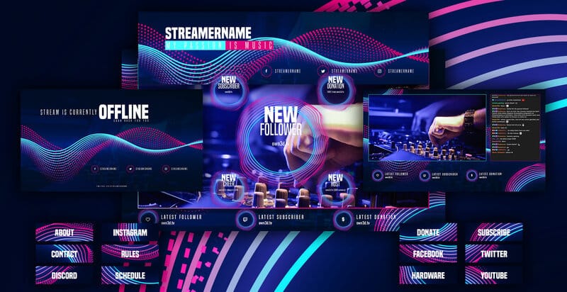
View it as a way to enhance your creative thinking and produce some truly outstanding ideas!
Another action you can take, which I have personally experienced, is to observe some of your favorite streamers.
You can find inspiration in the various elements present in their stream.
However, I must stress that this should not become the standard practice.
Identify your style and use these influences to guide your design choices, resulting in something unique and original.
These influences should not be your crutch; instead, they should serve as your guide.
You can use them as tools to improve and refine your creative design choices.
Therefore, feel free to take inspiration from your favorite streamers as you embark on your journey.
Bringing Ideas to Life
Next, expand on those ideas to strengthen your brand and improve your creative designs.
Finally, this point is very important: make sure you are following the latest creative design trends.
In recent years, there has been a notable evolution in design on Twitch.
From bland and unprofessional designs to overly loud, oversized elements that include every imaginable detail.
We are now entering an era of clean, simple design that highlights the content at hand.
This is the purpose of design.
Your designs, overlays, and branding should enhance your content.
Your design should not overpower your content.
Unless, of course, you are not an art streamer specializing in graphic design.
In that case, the design includes all the content that your Twitch channel should showcase!
There is one simple phrase I like to keep in mind while working on any of my designs: “KISS.”
KISS is an acronym that stands for “keep it super simple” or “keep it simple, stupid.”
Any option you choose should work as long as you remember it!
Widgets
Let us discuss widgets.
Widgets are just one of the many factors to consider when determining how to make your Twitch stream look professional.
Widgets are what energize your stream.
They allow your viewers to interact with your stream in real-time.
A few widgets can be found for free on the internet.
A fantastic starting point is OWN3D.tv!
*Use code STREAMMENTOR to get a 50% discount*
Here, you can find a variety of free tools, overlays, banners, and widgets to help you enhance the professionalism of your stream.
One of the widgets available for download thoroughly cleans your overlay.
It rotates all your metrics, eliminating the need to stack them up.
Another intriguing concept is a sub-train or a bit train.
You can include your own animations or choose a simple, minimal bar design.
A brand new “now playing” widget has been introduced.
This widget will link to your Spotify account.
This way, if you are using StreamBeats, the premier website for copyright-free music playlists, the names of the songs will be displayed on your screen.
Consequently, your chat will no longer need to repeatedly ask which song is playing.
They will be able to see it on your Twitch stream.
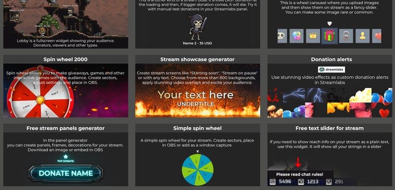
Widgets like these are a fantastic addition to your streams, and integrating them has never been simpler.
It adds a professional touch to your Twitch stream.
One recommendation I have is to find a way to integrate these widgets into your stream design to create a cohesive feel.
Today, the majority of widgets are merely browser sources.
You enter your information, copy the URL (link), and paste it into OBS.
I recommend adding at least one widget to your Twitch stream.
Add one that is not overly distracting from the content you are streaming and that effectively engages your audience.
Twitch Banners and Profile Pictures
The first thing viewers and visitors will notice when they access your offline channel is your Twitch banner and profile picture.
The Twitch banner, also known as a cover picture, is the element that will be the most prominent.
It is recommended that the banner be 1280px by 480px.
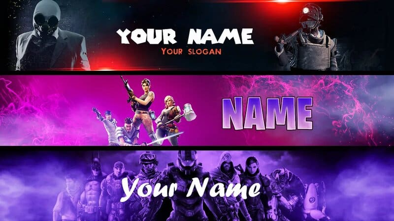
Make sure your Twitch banner showcases essential information that is pertinent to your viewers.
This may include information about your streaming schedule, social media accounts, or partnerships and sponsorships.
This is the perfect place to unleash your creativity and design a one-of-a-kind banner.
This will greatly enhance your streaming experience by attracting more viewers.
You might consider exploring color psychology to understand how colors affect people’s emotions and behaviors.
Whether consciously or subconsciously, this can greatly influence how you attract and retain viewers.
Most streamers use a photo of their face as their profile picture, enabling viewers to easily recognize whose profile they are viewing.
It is recommended that the photo size not exceed 10MB.
Twitch Overlays
This is where you will need to put on your serious thinking cap.
Twitch overlays are the graphics that your viewers see on their screens while watching your stream.
This is the most crucial aspect of your Twitch channel design, and it is undoubtedly the area where you should focus your attention the most.
In the past, overlays were often filled with information, but nowadays, streamers have begun to reduce the clutter on their screens.
This enables viewers to focus more on the content being presented to them.
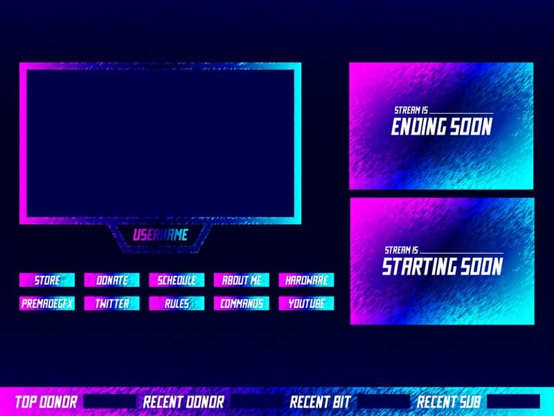
Staying updated on these trends related to Twitch stream overlays is important.
You want to make sure that your Twitch stream design does not appear outdated or old-fashioned.
This does not imply that you need to develop a completely new design periodically.
That would still require a significant amount of effort, even if you hire someone to design your channel.
However, consider making small adjustments and customizations to keep up with trends in your own unique and personalized way.
What Should Be Visible?
Now we will discuss what should be shown on your overlay.
There is no definitive answer to the topic at hand.
Depending on the type of content you intend to stream, different types of information will need to be shown on your stream overlay.
Getting this right can greatly affect how viewers perceive your Twitch stream.
It is a crucial factor in improving the appearance of your stream.
Although there is no definitive formula for what to include in your Twitch stream overlay, here are some suggestions that may help you.
Use a Webcam
It has been shown that people prefer watching streamers who have their face cam turned on.
Matching a voice to a face is always enjoyable. This connection helps viewers feel more comfortable while watching your streams.
You can also add a webcam border to enhance its style and create a more cohesive appearance with the content you are presenting.
QUICK OVERVIEW: Best Webcams
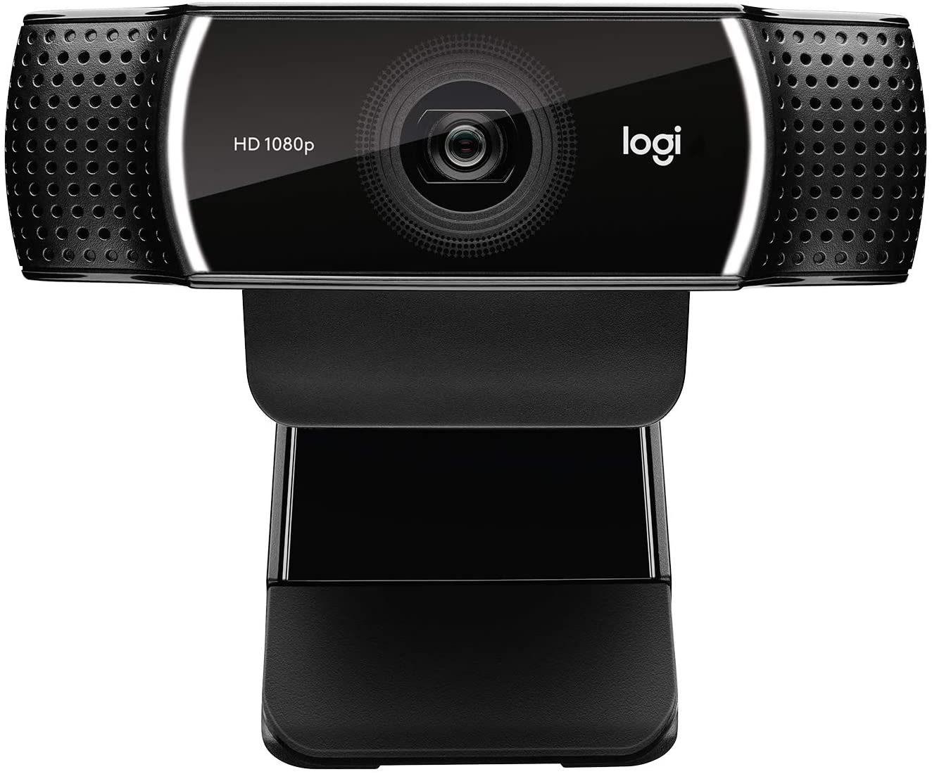 | Logitech C922x
| |
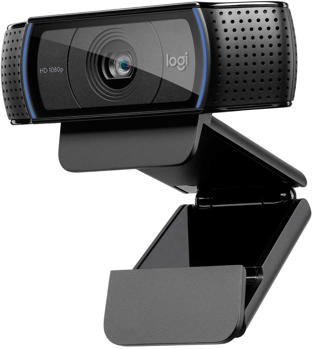 | Best Seller Logitech HD
| |
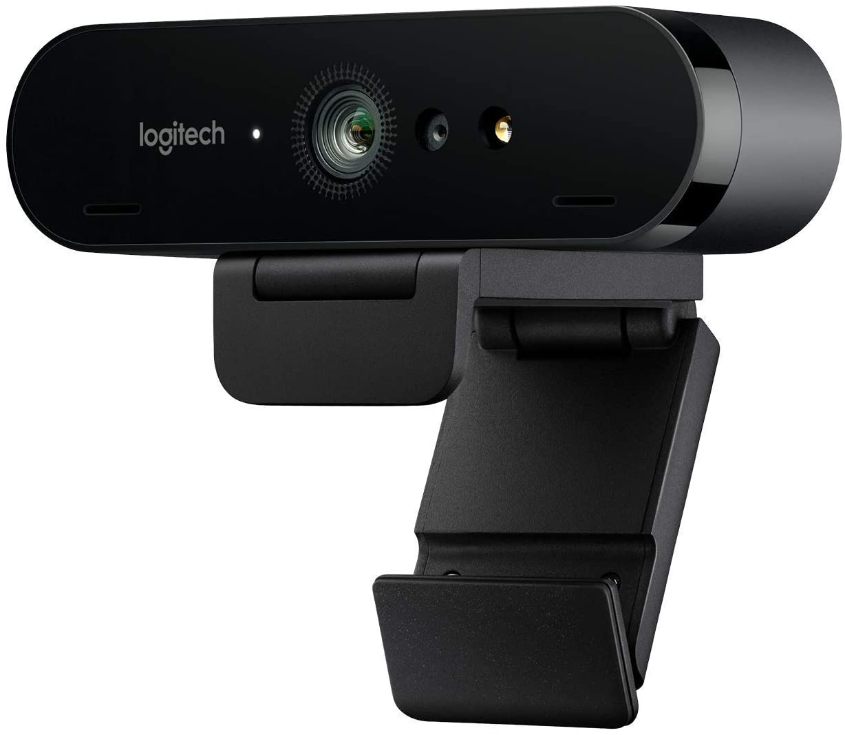 | Logitech Brio
|
Incorporating Recent Events
This can include items such as your most recent donation, your latest subscriber, or any new followers you acquire.
This can positively impact your audience by introducing a layer of interactivity between your stream and your viewers.
It can also motivate your viewers to subscribe and donate more often. Who wouldn’t want their name featured on a prominent Twitch stream?
I definitely would!
Branding Your Channel
This is a clear choice.
You want to optimize your marketing efforts, and this is one of the easiest ways to gain recognition.
Make sure to include your branding in your overlay. This may consist of elements like your logo or your name.
Avoid large and flashy designs, as they can divert your viewers’ attention from the content you want to share with them.
Do you remember that adorable little phrase I taught you? Keep it very simple!
Incorporating Pop-ups and Alerts
We will discuss what alerts are and how to customize them later in this article.
However, always make sure that your alerts are visible on your Twitch stream overlay.
This means that each time you gain a new follower or subscriber, your viewers will see a pop-up alert notifying them of the action that has taken place.
There are several types of overlays available for you to use. Take your time when making this creative decision for your Twitch channel.
Your goal is to strike the perfect balance between being informative and non-distracting. Ultimately, your content should captivate your audience.
Twitch Alerts
Twitch alerts offer a distinctive creative outlet for showcasing your imagination. They serve as a delightful and entertaining method to enhance your Twitch stream.
A Twitch alert usually includes a small pop-up image or GIF accompanied by a sound effect.
However, keep in mind that you have complete freedom to customize your own OBS Twitch alerts.
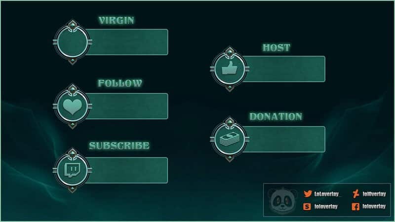
While the visual representation of the alert is important, the audio component should not be overlooked; it is equally significant.
Many streamers rely on generic free sound effects for their alerts, making this your chance to create something unique and personalized.
Why not think about using your own voice? Aim to keep these alerts brief.
Consider the time period when you gain new followers or subscribers on your Twitch channel.
You do not want your stream to be overwhelmed with continuous strings of sound effects.
This can negatively impact the viewer experience and may also harm your streaming experience.
Twitch Panels
Twitch panels are located on your Twitch channel page.
Twitch panels are visible whether you are online or offline with your stream.
They are generally used to provide additional information about your stream.
There is no wrong answer when it comes to the information you should include on your Twitch panels, but they should adhere to some of these guidelines, such as:
Add “About” Information
Introducing yourself to newcomers and explaining what you are all about is always beneficial.
Keep it concise and straightforward. Most people are not interested in reading your entire life story.
Books serve those purposes.
Add Links to Social Media Platforms
You cannot go wrong with publicity.
Even if your banner or offline image contains duplicate information, you should still include all the links to your social media accounts.
Add the Games You Play
A concise explanation of the overarching themes of your streams is an effective method to quickly engage your target audience.
If you are not actively playing your games, explain to your viewers what you are doing during your streams so they know what to expect.
Add Chat Rules and Community Values
Remember, this is your creative space, and you have the freedom to create the community you envision.
Establishing chat rules and customized community guidelines will help you remove toxic individuals from your stream.
Toxicity can negatively impact your streaming experience, but more importantly, it can damage the viewer experience, which is the last thing you want.
Add Equipment
Viewers frequently inquire about the equipment streamers utilize to produce their streams.
You can compile a list of all your equipment and include it in your Twitch panel.
This approach will stop viewers from repeatedly asking the same questions, enabling you to focus more on the content you are sharing.
How to Make Your Twitch Page Look Good – Conclusion
I hope this article has assisted you in finding solutions to enhance the appearance of your Twitch channel.
As I mentioned earlier, this is your creative space, so feel free to experiment with different ideas.
There is no definitive formula for becoming a successful streamer on the Twitch platform.
Pay attention to the trends and try to follow them with your personalized adjustments.
Wishing you the best of luck!
